If you are new to writing business proposals, you would benefit from a business proposal template.
Free Business Proposal Templates
I’ve provided links for different proposal templates that you can download for free. However, these won’t be as helpful as you think because they are often missing critical pieces. Plus, they often provide a design but don’t tell you what to put where.
In reality, most of the designs are pretty much unprofessional.
- Templates from Microsoft’s Site
- Proposal Templates from BidSketch (
requires sign up)
Paid Proposal Templates
GraphicRiver has some really neat proposal templates like these:
You have to pay for them and you need Adobe Indesign to use most of them.
But they are worlds better than the free templates out there.
How To Create You Own Proposal Template
You can create your own template. Just open up Microsoft Word and create a document with these sections.
- Table of Contents
- Cover Letter/Executive Summary
- Project Understanding
- Scope of Work/Approach
- Project Management/Execution Plan
- Relevant Experience
- Our Team
- Pricing
How To Make Your Proposal Template Work For You
I’m not a graphic designer. You may not have any formal graphic design training either. So, how can someone like us quickly put together a professional-looking proposal?
The Unspoken Truth About Proposal Template Design
Here’s the unspoken truth about proposal design. If you have a well-designed template, you don’t need any graphic design knowledge or capabilities to produce proposals that look good.
All you need is that template and minimal knowledge of page layout software like Adobe InDesign or QuarkXpress. In some cases, you can get away with a little Microsoft Word know how.
But what should be in your template? Today, I’m going to discuss three elements that should be in every single proposal template.
If yours does not have these, it’s time for a new template.
Readable Typography
One of the biggest challenges you’ll come across when working with designers will often be typography.
Just look at one reader’s frustration with her graphic designer:
“She is a really talented graphic designer, but wants everything to look like a magazine. No bullet points, no bolded text, nothing that she might consider bad graphic design.”
Sure, their body type will look beautiful. It will be some fancy san serif typeface, 9 or 10 points in size.
But give that proposal to a 55-year-old engineer, and they’ll struggle to read it.
That’s a problem because the clients evaluating your proposals are not typically young. In fact, they’re often old farts (like me)! 🙂
If it’s hard to read, they won’t read it.
The solution: make readability the #1 priority for your typography.
You can achieve this by using what’s known as the “golden ratio” to achieve the perfect balance of font size, line height, and line width.
Here’s a chart that illustrates this concept.
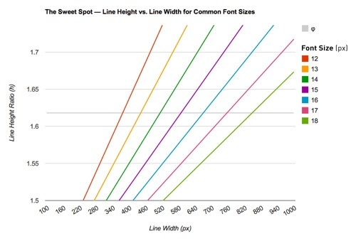
Please note, the measurement in this chart is in pixels, not points.
Next, you want to use a serif font for your body just like you would find in a best-selling book. I suggest Baskerville because of a study that showed the use of that font can help build trust.
Focus Boxes
You may have heard of “callout boxes.” These are boxes that you can use for quotes or highlight key pieces of information (like differentiators). Callout boxes are a staple of proposal templates.
But what are focus boxes?
The people evaluating your proposals rarely, if ever, have enough time to read every word in your proposal. Yet, they ask you for full resumes, detailed project writeups, etc.
This creates a conundrum that focus boxes solve. Focus boxes tell the reader why the person in the resume is the perfect fit for this assignment. Or it will show why the previous assignment, that we’ve provided a detailed write-up for, is relevant to the contract we’re proposing on.
Focus boxes give clients the information they need in the time they have. And they allow you to be both persuasive and compliant.
Here’s an example of a focus box in my premium template (included with Win Writing).
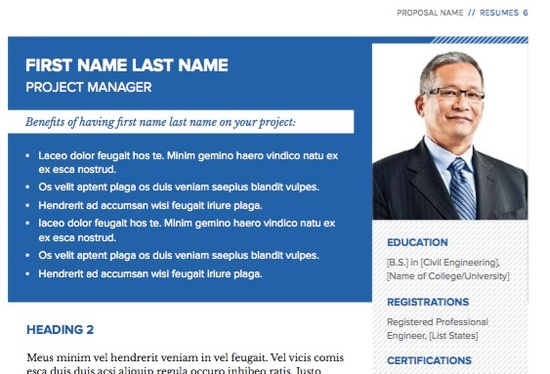
Resume focus boxes usually highlight 3-4 key reasons this person is a great fit.
Multiple Standard Covers
One of the biggest frustrations I hear from proposal professionals is the enormous time sink putting proposal covers together is.
Many architects and engineers (their bosses) place a level of importance on the cover design that far outweighs any influence it would have on selection.
When I worked with HOK, the biggest architecture firm in the US, they had a solution: standard covers.
Your proposal template should have multiple standard cover designs so you can provide the powers that be a few different options for each
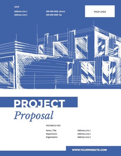
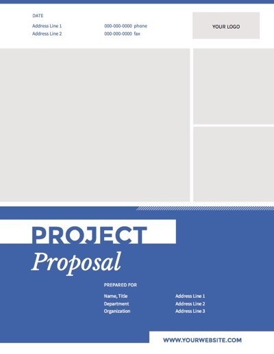
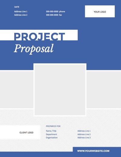
Here are the three covers included in my template.
This is my first standard cover in the premium template included in Win Writing.
Here is the second cover choice. You can easily change the colors and elements in templates like this to fit your brand.
Here’s the third cover option. You can use either of these options without needing to change anything else in the template.
You Don’t Have To Be A Designer
Go out and commission your own proposal template with these features. Or, if you have the skill set, create one yourself.
Read: How To Get Good Graphic Design For Cheap
Or you can save yourself the frustration and just use mine. Learn more about the proposal templates in Win Writing at this link.
Read The Other Sections Of My Ultimate Guide To Proposal Writing
The article you just read is one section of my Ultimate Guide To Proposal Writing.
Click on the links below to read the other parts.
- Part One: Proposal Writing Basics
- Part Two: The Proposal Structure
- Part Three: The Proposal Writing Formula
- Part Four: The 3 Golden Rules Of Proposal Design
- Part Five: Proposal Templates: What You Need To Know
- Part Six: Architecture, Engineering, and Construction Proposals: How To Write Them


[…] Part Five: Proposal Templates: What You Need To Know […]